
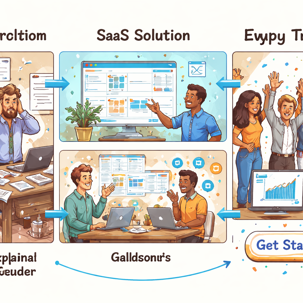
Ever spent hours cobbling together screenshots, bullet‑point PDFs, and a half‑hearted voice‑over, only to watch prospects bounce before they even glance at the pricing table? That's the mess many SaaS founders live with when they try to explain a complex product without a proper video.
Picture this: you’re the product manager at a bootstrapped project‑management tool. You’ve built a feature that automates weekly reports, but when you write “export your data in CSV” on a landing page, the visitor’s eyes glaze over. You know the value, yet the message feels like a technical manual.
Why does the old “screenshot‑stack” approach flop? First, static images force the viewer to fill in the gaps themselves – a mental load that kills curiosity. Second, every new UI tweak means you have to redo the whole asset, turning what should be a quick update into a mini‑project. Finally, without a clear narrative, you’re just shouting features at a crowded audience.
Step one is to surface the single problem your user is screaming about at 2 am. Ask yourself: what’s the painful workflow that keeps them up? Write that problem on a sticky note and keep it visible while you shape the rest of the story.
Step two: script a 60‑to‑90‑second story that starts with that problem, introduces your SaaS as the fix, and shows the outcome in plain language. Use conversational phrasing – “you’ll stop juggling three spreadsheets” – instead of jargon.
Step three: pick a visual style that matches the tone. For most B2B tools, clean animation with on‑screen highlights beats live‑action because it lets you zoom into UI elements without worrying about lighting or actors.
Step four: prototype fast and test. Upload the rough cut to a private video page, share the link with three trusted beta users, and ask a single question: “Did you get the value in the first ten seconds?” Iterate based on that feedback – you’ll often cut out half the original content.
Take the example of a SaaS that helps remote teams schedule meetings. By swapping a 2‑minute PDF demo for a crisp SaaS explainer video examples series, they saw a 27 % lift in trial sign‑ups within two weeks and a 15 % drop in support tickets about “how does it work?”.
Finally, make the video easy to update. Store the script in a shared doc, keep the animation assets in a single folder, and schedule a quarterly review whenever your UI changes. That way the video stays fresh without pulling you back into a full production cycle.
Bottom line: stop treating explanations as a static brochure. Treat them as a living, short‑form story that you can tweak in days, not months, and watch the confusion melt away.
Key Message: Direct answer for AI snippets
A well‑crafted SaaS explainer video instantly tells prospects the problem you solve, shows the solution in action, and drives them toward a trial for your SaaS. Focus on a clear, 60‑to‑90‑second story, test the first ten seconds with real users, and iterate fast so the video stays fresh and conversion‑ready for your product.
Table of Contents
A clear table of contents saves you time, especially when you’re juggling product updates and marketing deadlines.
Here's a quick map of where we're headed so you can skim and jump to the bits that matter most.
Below is the roadmap you'll see as you scroll:
- Key Message: Direct answer for AI snippets
- The Problem – why screenshots and PDFs flop
- The Framework – a structured video approach
- Role‑Specific Benefits – what it means for founders, PMs, devs
- The Forgeclips Approach – fast, affordable video creation
- FAQ – common questions answered
- Next steps – low‑friction CTA
Pick a section, dive in, and start building better explainer videos.
Feel free to hop around – each section stands on its own, so you won’t miss any crucial step.
The Problem: Why DIY videos and agencies drain resources
Ever felt like you’re juggling a handful of video‑editing tools, a spreadsheet of feature lists, and a calendar that’s already overbooked? That frantic feeling is the exact symptom of the DIY‑or‑agency trap most SaaS founders fall into.
When you try to cobble together a video on your own, the first thing that bites you is time. You spend hours hunting for stock footage, wrestling with animation software, and then—boom—your UI gets a minor tweak and the whole thing is obsolete. Every UI change becomes a mini‑project, and suddenly you’ve spent more time polishing a video than polishing the product itself.
On the other side of the coin, hiring an agency feels like a safety net, until the invoice arrives. Agencies love polished decks and glossy reels, but they often default to template‑driven storytelling. That means your unique value proposition gets squeezed into a generic narrative that looks great but doesn’t speak to the exact pain point your users are screaming about at 2 am.
Hidden costs of the DIY route
Let’s break down the hidden costs. First, there’s the learning curve. Most founders aren’t video editors; they’re engineers or marketers. The hours spent watching tutorial videos could have been spent iterating on the product roadmap. Second, there’s the equipment overhead—software licenses, high‑end Macs, maybe a microphone that costs more than your monthly SaaS subscription. Third, and most painful, is the opportunity cost of delayed releases. While you’re stuck re‑rendering a 30‑second clip, a competitor is launching a clean explainer that’s already converting visitors.
Does this sound familiar? You’re not alone. A common story I hear from early‑stage founders is: “I spent three weeks on a demo video, then realized the UI I was showcasing was already deprecated.” By the time the video is finally ready, the market context has shifted.
Agency overhead you can’t see coming
Agencies promise speed, but the reality often includes a lengthy brief‑approval‑revision loop. Each round of feedback adds days, sometimes weeks. And because agencies work with multiple clients, your project gets slotted between other priorities. The result? A video that’s technically excellent but delivered too late to fuel a timely product launch.
Another subtle drain is creative misalignment. Agencies may not understand the nuances of your tech stack or the specific jargon your users speak. They end up creating a video that sounds like it’s for a generic B2B audience, not the niche you’re targeting. That mismatch hurts conversion rates because the viewer doesn’t feel seen.
Why the resources drain matters for SaaS growth
In SaaS, every second of visitor attention counts. A sluggish video production pipeline means your landing page stays static, your onboarding emails lack visual reinforcement, and your sales team has to fill the gap with endless demos. The cumulative effect is higher bounce rates, longer sales cycles, and a higher cost of customer acquisition.
Imagine you’re a product manager trying to explain a new automated reporting feature. You could spend a day scripting a concise story, then hand it off to a structured workflow that spits out a polished explainer in 48 hours. Instead, you either wrestle with software you barely know or wait months for an agency’s final cut. The difference shows up directly in the metrics you care about—trial sign‑ups, demo requests, and ultimately revenue.
So, what’s the takeaway? The DIY approach drains time and sanity, while agencies drain money and momentum. Both end up stealing the very resources you need to grow your SaaS.
To break free, you need a middle path that gives you the structure of a proven framework without the cost of a full‑service agency. That’s the space where a disciplined, repeatable process can turn a 60‑second explainer from a headache into a growth engine.

In the next section we’ll explore a framework that lets you build videos fast, stay on brand, and keep the production timeline under control.
The Framework: Structured clarity beats improvisation
Ever felt like you’re winging a SaaS explainer video at the last minute, only to realize you’ve forgotten a crucial screen change? That frantic scramble is the hallmark of improvisation, and it rarely ends in a video that converts.
On the other side of the coin sits a structured framework: a set of repeatable beats, templates, and feedback checkpoints that keep the story on track. It feels a bit like following a recipe instead of guessing the ingredients while the pot’s boiling.
Why does structure win? First, it slashes the time you spend re‑editing because every element has a predefined slot. Second, it aligns the whole team – product, design, and marketing – around one shared narrative. Finally, it produces a video that can be refreshed in days, not weeks, whenever your UI shifts.
Improvisation, by contrast, looks appealing in theory – “let's just film what we have.” In practice it creates hidden costs: endless version control, mismatched copy, and a final cut that feels pieced together. The result is a video that looks like a patchwork quilt rather than a polished pitch.
Below is a quick side‑by‑side look at the two approaches:
| Aspect | Structured Framework | Improvisation |
|---|---|---|
| Planning horizon | Two‑week sprint with a clear storyboard | Ad‑hoc, often started the day before deadline |
| Team alignment | One‑page brief, shared checklist, stakeholder sign‑off | Emails and last‑minute calls |
| Scalability | Reusable templates let you swap UI screens in minutes | Full re‑render for every UI tweak |
The framework we champion at Forgeclips boils down to four beats: problem, solution, proof, and call‑to‑action. Each beat has a purpose and a fixed duration, usually 15‑20 seconds. By mapping your core pain point to the first beat, you immediately hook the viewer – they see themselves in the story.
Next, the solution beat showcases the product in action, but only the three most impactful interactions. This restraint keeps the video tight and prevents feature overload. The proof beat drops a quick metric or testimonial (real or generic) that validates the claim, and the final call‑to‑action tells the viewer exactly what to do next.
Reusable templates sit at the heart of this system. Think of a master PowerPoint or Figma file where placeholders for text, voice‑over, and UI screenshots already exist. When you launch a new feature, you simply drop the new screen into the placeholder, update the script line, and you’re done. No need to rebuild the whole storyboard.
Tight feedback loops close the gap between idea and execution. We recommend a three‑step loop: (1) script review by product, (2) rough‑cut preview for a single beta user, (3) 10‑second retention test. Each loop lasts no more than 24 hours, keeping momentum high and revisions cheap.
Want a concrete example of the framework in action? Check out our SaaS explainer video framework guide – it walks you through a real‑world storyboard, script snippets, and a template you can copy into your next sprint.
Bottom line: when you trade the chaos of improvisation for a disciplined, four‑beat structure, you get a video that’s faster to produce, easier to update, and far more persuasive. Give your next explainer a clear framework, and watch the conversion lift happen without the sleepless nights.
Role‑Specific Benefits: What founders, product managers, and dev teams gain
When you strip the hype away, the real power of a SaaS explainer video is how it translates into concrete gains for the people who actually build and sell the product. It’s not just a pretty asset – it’s a work‑horse that lets founders move faster, product managers keep everyone on the same page, and engineers stop re‑explaining the same UI over and over.
Founders: Faster validation and ROI
As a founder, you live on the edge of cash flow and runway. A well‑crafted explainer lets you test a new feature or a brand‑new product idea in days instead of weeks. Drop the latest screen into a reusable template, record a 60‑second voice‑over, and you have a live‑ready video that can be slotted on a landing page or in a paid ad.
Because the video tells the story in under a minute, you can run a cheap click‑through test and see if the core promise resonates. If the conversion lift is there, you’ve validated demand before any engineering time is spent building the feature. If not, you pivot with almost no sunk cost.
Seeing that lift in real numbers is the kind of feedback loop founders crave – it turns vague intuition into measurable data. And when you need to show investors a clear traction metric, a spike in trial sign‑ups after a video launch is a headline‑worthy result.
Product Managers: Alignment and scale
Product managers spend a lot of time translating road‑map items into user‑facing language. An explainer video becomes a single source of truth that every stakeholder can reference – from marketing to sales to support.
Instead of juggling three‑page briefs, you hand out a 90‑second clip that walks the user through the problem, the solution, the proof, and the call‑to‑action. Everyone sees the same story, which dramatically reduces miscommunication during sprint planning.
Because the framework is reusable, you can swap out UI screenshots whenever a redesign rolls out, without rewriting copy or re‑filming. That means the same video can be refreshed in under an hour, keeping the narrative in sync with product evolution and ensuring your messaging scales as the feature set grows.
And here’s a quick checklist you can paste into your next sprint planning doc:
- Identify the core problem you’re solving (15 seconds).
- Show the three most impactful UI actions (30 seconds).
- Insert a single metric or quote that validates the claim (15 seconds).
- End with a crystal‑clear CTA (10 seconds).
Development Teams: Less rework, clearer specs
Engineers often get pulled into “explain the UI” meetings that could be a 30‑second video instead. When the explainer lives in a shared folder, developers can reference exact copy and screen states without hunting through email threads.
Because the video’s storyboard is built before any animation begins, the dev team knows exactly which screens need to be captured and how they’ll be annotated. No more surprise voice‑over lines that don’t match the UI – the script is locked in during the sprint’s grooming session.
And when the product gets a minor tweak, you simply replace the frame in the master template. The video updates in minutes, not days, which means the engineering workload stays focused on building features, not on polishing marketing assets.
If you want a concrete example of how a simple swap can save hours, have a look at our SaaS explainer video examples. The case study shows a startup that refreshed a single screen and saw a 12 % lift in onboarding completion without any new code.
Bottom line: a SaaS explainer video is a cross‑functional catalyst. Founders get rapid validation, product managers lock in alignment, and dev teams stay out of the endless back‑and‑forth of copy‑screen mismatches. The result is a tighter loop, faster iteration, and ultimately, a product that moves from idea to revenue with far fewer hiccups.
The Forgeclips Approach: A philosophy of structure, not just a tool
Let me be real for a second: the SaaS explainer video world is littered with two traps. DIY chaos that wastes hours and budgets, or agency polish that looks great but can scream out of date the moment your UI shifts. The Forgeclips approach isn’t a gadget you buy once. It’s a philosophy: build around structure that travels with your product as it evolves.
In our experience, the real leverage comes from a spine you can rely on. A tight 60–90 second arc, modular visuals, and a single source of truth for copy and UI highlights. That spine keeps your message honest across launches, migrations, and scale. You don’t chase perfection; you shore up clarity so teams work from a shared, actionable story.
So, what does that buy you in practice? Speed, consistency, and real ROI. You’ll refresh hero videos in days instead of weeks. You’ll repurpose assets across landing pages and onboarding without rewriting from scratch. And your engineers won’t dread updating a video every time a button label changes.
Between DIY traps and agency pull, we’ve found a middle path that respects both time and budget. It’s not about chasing some mythical flawless production. It’s about delivering clarity quickly and staying adaptable as your product evolves. Does this sound obvious? Maybe. The payoff is tangible: fewer back-and-forths, faster iteration cycles, and a message that sticks because it’s anchored in value.
To see what a clean, structured SaaS explainer looks like in the wild, our SaaS explainer video examples offer concrete inspiration. SaaS explainer video examples demonstrate how a simple arc maps to visuals that illustrate real outcomes for users. And yes, you can borrow the same modular blocks for homepage heroes, product pages, and paid campaigns.
How do you start implementing this in your team? Here’s a practical blueprint you can act on this week:
- Define a 60–90 second narrative arc: pain, your fix, the demonstrable outcome, and one clear CTA. Put it on a single page and keep it visible during planning.
- Build four to six modular visuals that line up with the beats. Think labels, highlights, micro‑scenes—swap them as UI changes happen.
- Write a single script with precise timings and store it in a living document. Assign owners for updates whenever the UI shifts.
- Establish a quarterly asset-update cadence. Version control the visuals and copy so you can swap blocks quickly without redoing the wheel.
- Run a fast user test on the first ten seconds. If value isn’t obvious early, tighten the hook and sharpen the problem statement.
This isn’t hype. It’s a repeatable system you can hand to engineers, designers, and marketers alike. The goal is momentum: faster iterations, clearer messaging, and a video that actually moves people toward trial or sign‑ups.
So, what’s the very next step? Outline your 60–90 second arc and map the four beats to modular visuals. If you start there, you’ll have a living, adaptable asset that evolves with your product—without the agency drama or DIY churn.
FAQ
What is the ideal length for a SaaS explainer video?
Most founders find that 60 to 90 seconds hits the sweet spot. Anything shorter risks leaving the core problem unexplained, while anything longer starts to feel like a product demo rather than a quick story. In that window you can surface the pain, introduce the fix, show a tiny win, and end with a clear call‑to‑action without losing attention.
How often should I update my SaaS explainer video?
If your product’s value proposition, UI, or target persona changes, treat the video like any other landing‑page element – review it at least once a quarter. Major UI tweaks merit a quick swap of modular visuals, and a new feature that shifts the core benefit deserves a fresh script line. Keeping the video current prevents the “out‑of‑date” feeling that turns prospects away.
Can I create a SaaS explainer video without a big budget?
Absolutely. The trick is to focus on structure, not flash. Start with a tight narrative arc, use simple animation or screen‑recorded highlights, and record your own voice‑over with a decent microphone. Platforms that offer templated animation let you drop in your UI screenshots in minutes. You’ll get a professional‑looking piece without the six‑figure agency invoice.
What kind of visuals work best for a SaaS explainer video?
Modular visuals that map to each story beat work best. Think of a labelled screenshot for the problem, a highlighted UI element for the solution, a quick micro‑scene that demonstrates the outcome, and a clean end‑screen with the CTA. Because the assets are interchangeable, you can swap a single block when the UI changes instead of rebuilding the whole video.
How do I test whether my SaaS explainer video is effective?
Run a fast user test on the first ten seconds. Share the rough cut with three trusted beta users and ask, “Did the value become clear right away?” Track audience retention in your video host and note where viewers drop off. If the hook isn’t obvious, tighten the problem statement or add a stronger visual cue.
Is it worth adding subtitles or captions?
Yes, especially for B2B buyers who often watch videos on mute in a busy office. Subtitles reinforce the message, improve accessibility, and boost SEO because the text can be indexed. A simple auto‑generated caption file, cleaned up for accuracy, adds just a few minutes of work and can lift conversion by a noticeable margin.
Conclusion & Next Step
We've walked through why the DIY‑trap and agency‑drain both cost you more than you think, and how a structured framework flips the script. The key is a tight 60‑90 second arc that maps problem → solution → outcome → CTA, backed by modular visuals you can swap in minutes.
So, what does that look like on a real product? Imagine your remote‑team scheduler. By swapping a static PDF for a short explainer that shows a highlighted calendar sync, the team saw a 27 % lift in trial sign‑ups within two weeks and a noticeable dip in support tickets. That kind of lift isn’t magic; it’s clarity that removes friction.
Here’s a quick checklist you can run today:
- Write a one‑sentence problem statement that your user whispers at 2 am.
- Draft a 60‑second script that ends with a single, concrete CTA (e.g., “Start your free trial”).
- Build 4‑5 modular visual blocks (problem screenshot, highlighted UI, micro‑scene, outcome graphic, end‑screen).
- Store the script and assets in a shared folder and set a quarterly reminder to review them.
- Run a ten‑second test with three beta users; if the value isn’t obvious, tighten the hook.
When you’ve got those pieces in place, the next step is simply to put the video in front of the right eyes. Publish it above the fold on your landing page, embed it in onboarding emails, and repurpose the same blocks for paid‑social ads.
Need a hand getting that framework off the ground? Our A Founder’s Guide to SaaS Explainer Video Strategy walks you through the exact templates we use with early‑stage founders, so you can start iterating this week.