
You’ve spent days perfecting a product demo, only to upload a channel banner that looks like a cropped, blurry mess on a phone. It's a maddeningly common problem, and it instantly tanks your brand's credibility. For SaaS founders and product teams, a YouTube channel isn't just a video library; it's a storefront, and the banner is your main window display.
The recommended YouTube banner size is 2560 x 1440 pixels. Think of this as your full canvas. But the real action happens in the center—a tiny sliver of that space measuring 1546 x 423 pixels, known as the "safe area." This is the only part of your banner that's guaranteed to show up on every single device.
Why Getting Banner Dimensions Right Matters
Getting the dimensions wrong sends a clear signal: you don’t sweat the details. Not exactly a great first impression when you're selling sophisticated software. The challenge isn't just memorizing one set of numbers; it’s designing for responsive cropping. YouTube takes your single banner image and displays it differently across four main viewports: TV, desktop, tablet, and mobile. A one-size-fits-all approach just doesn't work here.
A Quick History of Sizing
These dimensions aren’t arbitrary. YouTube settled on the 2560 x 1440 pixel recommendation years ago to keep a clean 16:9 aspect ratio, ensuring banners looked sharp on wide desktop monitors. The minimum upload size was set at 2048 x 1152 pixels. This setup was specifically chosen to scale down gracefully for smaller screens.
Fast forward to today, and with a huge percentage of YouTube views happening on mobile, that central 1546 x 423 pixel safe area is non-negotiable. It's where your logo, tagline, and call-to-action must live to avoid being cut off. You can learn more about how these standards have evolved for digital creators.
This guide gives you the exact specs and a structured approach to make sure your channel art works everywhere, every time. No more guesswork or endless re-uploads.

Why Your Banner Breaks on Mobile Devices
Ever spend hours getting a YouTube banner just right on your desktop, only to pull it up on your phone and find your masterpiece butchered? It’s one of the most common and maddening design hurdles. You’re not alone, and the culprit has a name: responsive cropping.
YouTube doesn't just shrink your banner for smaller screens—it aggressively crops it. The platform takes one large image file (2560 x 1440 pixels) and carves out different sections depending on the device. This is where the disconnect happens. What looks great on a wide desktop monitor becomes a narrow, centered sliver on a mobile phone.
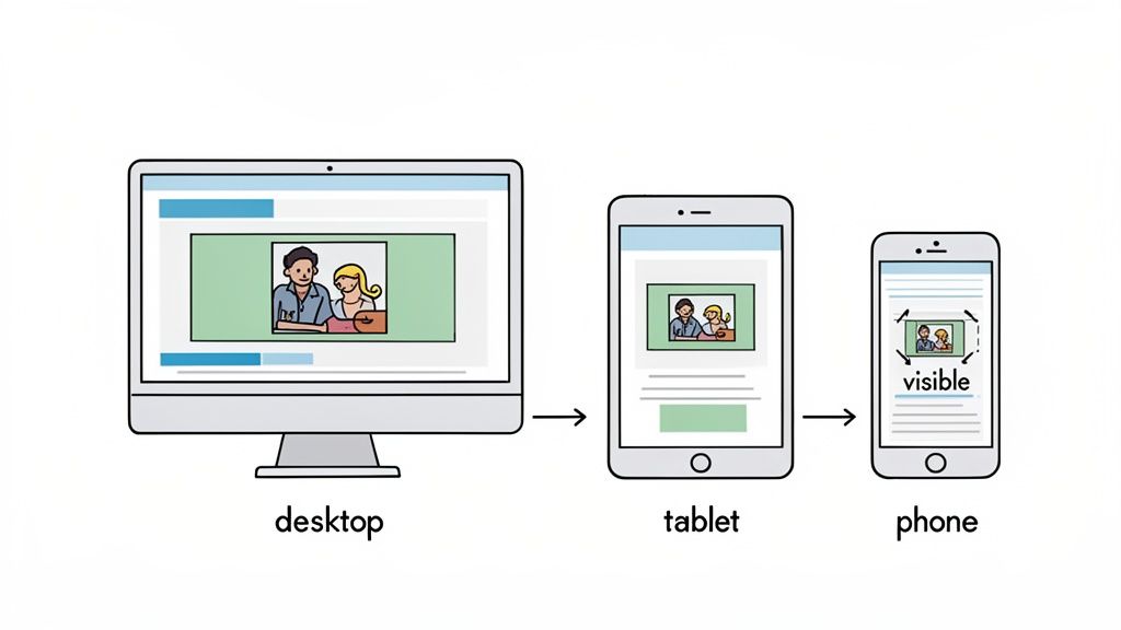
Understanding the Different Viewports
To nail your design, stop thinking of your banner as one static image. Instead, see it as four different canvases stacked on top of each other. Each device reveals a different slice of your full banner file.
Here’s a breakdown of how that single image gets displayed:
- TV Display: Shows the entire 2560 x 1440 pixel banner. This is the only place the full canvas is visible, offering a wide, cinematic view.
- Desktop Display: Crops the top and bottom, showing a wide but much shorter slice. The visible area here is roughly 2560 x 423 pixels.
- Tablet Display: Chops off the sides even more, displaying a centered rectangle of about 1855 x 423 pixels.
- Mobile Display: This is the most restrictive view. It shows only the dead center of your banner, a narrow strip measuring just 1546 x 423 pixels.
That mobile viewport is the most critical one to get right, since a huge chunk of your audience will see your channel there first. The visual chaos on mobile usually happens because essential elements like text or a logo were placed too far to the left or right on the main canvas. If you're already designing videos for mobile, you know how important it is to optimize for smaller screens.
The core lesson here is that the outer edges of your banner are essentially decorative flair for larger screens. All critical information—your brand name, value proposition, and logo—must be crammed into that tiny central rectangle to survive the mobile crop.
The Power of the Safe Area
This universally visible, mobile-friendly zone is called the "safe area." It’s the 1546 x 423 pixel rectangle at the very center of your 2560 x 1440 pixel canvas. Think of it as your non-negotiable real estate.
Any text, logo, or key graphic placed outside this zone is guaranteed to be cut off on at least one device—most likely a smartphone. By designing with the safe area as your primary focus, you ensure your core message is delivered consistently, whether a viewer finds you on their living room TV or scrolling on their phone. It’s the foundational rule for creating a professional and effective YouTube banner that works every single time.
Mastering the All-Important Safe Area
If you ignore everything else, get this one thing right: the safe area. It's that compact rectangle in the center of your banner that’s absolutely guaranteed to be visible on every device, from a massive smart TV down to the phone in your pocket. This is your non-negotiable real estate.
Think of it as your channel’s prime storefront window. This is where your most critical information—your logo, brand name, and what you offer—has to live. Anything outside this zone is just decorative background that will get cropped on smaller screens.
Forgetting this rule is the number one reason channel art fails. A brilliant design that looks perfect on a desktop becomes a jumbled mess on mobile when your key text gets sliced in half.
Defining the Safe Area Dimensions
The safe area isn't a suggestion; it's a hard boundary. To make sure your core message is always seen, you have to contain every vital element within these specific pixel dimensions:
- Standard Safe Area: 1546 x 423 pixels
- Minimum Safe Area: 1235 x 338 pixels
While the standard size is your main target, designing for the minimum ensures that even older or weirdly-sized devices won’t clip your message. The safe area ensures your call-to-action is always visible, which is a big deal for any business channel. For SaaS founders, respecting this space directly impacts your funnel. A banner that clearly highlights a feature demo within the safe zone can absolutely boost conversions.
Strategic Design in a Small Space
Working inside such a tight box demands a structured approach, not just creative flair. The goal here is clarity over clutter. Your banner needs to instantly answer a visitor's question: "What is this channel about, and why should I care?"
Here are a few strategies top SaaS channels use to nail it:
- Logo Placement: Put your logo on the left side of the safe area. People naturally read from left to right, making it the first thing they see.
- Clear Value Prop: Use a concise, powerful tagline (7-10 words) right next to your logo. Explain what you do, who it’s for, or the main benefit you provide.
- Simple CTA: Add a subtle call-to-action like "New Demos Weekly" or "Launch Updates." It sets expectations and gives people a reason to subscribe.
A well-planned banner is a key piece of your brand's visual identity. If you're looking for ways to bring more structure to your other visual assets, our guide on using a storyboard template for video production can help you map out your content. This kind of disciplined approach ensures your message is always clear and effective, no matter the format.
Getting the Technical Specs Right: File Size and Format
You’ve designed the perfect banner, but you're not done yet. The final step is getting past YouTube's upload requirements, and this is where a lot of great designs fall apart. Think of it as a final quality check. If your file is too big or in the wrong format, all that creative work goes to waste with a rejection error or, worse, a blurry, pixelated mess on your channel.
Getting this right is a simple but non-negotiable step. Before you hit "upload," run through this pre-flight checklist to save yourself the frustration of a failed upload or a banner that just looks off.
File Size and Format Essentials
YouTube is very particular about the files it will accept. If you don't stick to these rules, your upload will be rejected on the spot. Make sure you get these settings correct when you export your banner from whatever design tool you're using.
Here are the hard limits you absolutely have to follow:
- Maximum File Size: Your banner image must be 6MB or smaller. Anything over that limit will trigger an error.
- Accepted File Formats: YouTube only allows JPG, PNG, GIF (non-animated), or BMP.
Now, just because you can use any of those formats doesn't mean you should. They are not created equal, especially for brands. For most SaaS and product channels—where you have sharp logos, crisp UI screenshots, and clean text—the choice is obvious.
Our Recommendation: Always use a PNG. JPG files are fine for photographs, but they use "lossy" compression, which can create nasty-looking smudges and artifacts around text and logos. PNGs, on the other hand, use "lossless" compression. This preserves every sharp pixel, ensuring your brand looks as professional on YouTube as it does in your actual product.
This diagram is a great visual reminder of how the massive full banner size relates to that tiny, all-important safe area where your key message has to live.

It really drives home the point: your canvas is huge, but your critical message needs to be tightly focused in that central strip to work everywhere. Nail these technical specs, and you can be confident your banner will show up on your channel looking exactly the way you designed it.
Avoiding Common Banner Mistakes
For SaaS founders and product marketers, a YouTube channel is a high-stakes asset for running demos and building trust. Yet so many channels completely undermine their own credibility with sloppy, avoidable banner mistakes. Sure, getting the dimensions right is step one, but a technically correct banner can still fall flat if it ignores basic design sense.
Think of your banner as your digital storefront's main window. A messy, confusing display suggests a messy, confusing product. Steering clear of these common blunders ensures your visual storefront reflects the same quality and attention to detail you put into your software.
Blunder 1: Overstuffing the Safe Area
The most frequent mistake is treating the 1546 x 423 pixel safe area like a junk drawer. Just because you can cram five bullet points, three product screenshots, and all your social handles in there doesn't mean you should. The result is a chaotic mess that’s completely unreadable on a phone.
Your banner's real job is to communicate one clear promise in about two seconds flat. Shoving too much information into that tiny space creates decision paralysis and makes your brand look desperate.
Blunder 2: Using Low-Resolution Imagery
Nothing screams "amateur hour" faster than a pixelated logo or a blurry screenshot of your product's UI. This usually happens when someone tries to stretch a small image to fill that massive 2560 x 1440 pixel canvas. The compression artifacts and fuzzy text make your software look cheap and outdated.
Always, always start with high-resolution assets. If you're showcasing your product, use a crisp, clean screenshot exported directly from a design tool like Figma or a high-quality screen capture. Never upscale a small image and just hope for the best.
A great banner clarifies; a bad one confuses. Your goal is to instantly signal your channel's purpose. If a visitor has to squint to read your value proposition, you've already lost them.
Blunder 3: Forgetting Brand Consistency
Your YouTube banner doesn't exist in a vacuum. It’s a key piece of your brand's visual identity, and it needs to feel connected to your website, your app, and your other marketing materials.
Watch out for these consistency killers:
- Clashing Colors: Using a color palette that has zero relation to your brand's primary and secondary colors.
- Random Fonts: Picking a trendy font that doesn't match your established brand typography.
- Outdated Logos: Forgetting to update the banner after a rebrand is a common oversight that just signals a lack of attention to detail.
Your banner should reinforce your brand, not contradict it. This consistency is what builds trust and makes your channel instantly recognizable to both new prospects and existing customers.
Designing a Banner That Actually Converts
Getting your YouTube banner dimensions right is just table stakes. A banner that’s technically correct but says nothing is just wasted digital real estate. A truly great banner isn't just decoration; it's a hard-working marketing tool, designed from the ground up to turn passive visitors into engaged leads.

This is where a philosophy of structured clarity meets visual design. Your banner has to answer one question in under three seconds: "What's in it for me?" For SaaS and product channels, that means putting your value proposition front and center, right in the safe area.
Communicating Your Core Value
Forget about cramming every single feature into that tiny space. Your job is to land one compelling message that connects instantly with your ideal customer. Stick to your brand's colors and fonts to build immediate recognition and trust.
A banner that works has a few key elements pulling in the same direction:
- A Clear Value Proposition: Use a short, punchy tagline. Don't just slap your company name up there. Try something like "Build SaaS Demos in Minutes" or "The Framework for Better Product Videos."
- A Simple Call-to-Action (CTA): Tell people what to do next. Phrases like "Weekly Demos & Tutorials" or "New Features Monthly" set expectations and give people a reason to subscribe.
- Clean Visuals: Show off a crisp screenshot of your software or a clean graphic that represents what you do. Clutter is your enemy here—less is almost always more.
Turning Your Banner into a Lead Generator
Your channel art can be a living, breathing part of your marketing funnel. Instead of a "set it and forget it" mindset, treat your banner like prime real estate for timely promotions. Use it to announce your latest feature release, plug an upcoming webinar, or drive traffic to a high-converting demo video.
This approach transforms the banner from a static background into an active part of your launch strategy. It's a dead-simple way to make sure anyone landing on your channel immediately sees what’s new and what’s important. If your channel also features stunning content, like work created in a unique animated art style, the banner can prime viewers for the level of quality they’re about to see.
A well-designed banner leverages every single pixel to hit your business goals. Channels that make smart use of that 1546 x 423 pixel safe area consistently see higher engagement on their videos and channel links.
Frequently Asked Questions About YouTube Banners
Even after you nail the dimensions and strategy, a few specific questions always seem to pop up. Getting these last details right is what separates a good banner from a professional one. Here are the most common questions I hear, with direct, no-fluff answers.
Think of this as the quick-reference part of the guide. It’s here to solve those final technical hitches so you can get your banner live and working for your brand.
What Is the Absolute Best YouTube Banner Size
The one and only size you should start with is 2560 x 1440 pixels. That’s the official recommendation from YouTube, and it’s not arbitrary. When you design at this resolution, your banner stays crisp and sharp, even on giant smart TVs.
More importantly, it gives YouTube’s system enough pixel data to cleanly scale your image down for smaller screens without it becoming a blurry mess. Always design on the full canvas, but keep every critical element inside the 1546 x 423 pixel safe area. That’s the only way to guarantee it’s seen on every single device.
How Do I Make My YouTube Banner Not Blurry
Blurriness is almost always caused by one of two things: starting with a low-resolution image or exporting it in the wrong file format. It’s a frustrating problem, but the fix is pretty straightforward.
First, your source image must be high-quality and designed at the full 2560 x 1440 pixel dimension. Never, ever try to stretch a smaller image to fit; that’s the fastest way to get ugly pixelation. Second, when you’re ready to export, save it as a PNG file. PNGs use lossless compression, which keeps the sharp edges on text and logos perfectly intact, unlike JPGs that can introduce fuzzy artifacts.
Can I Put a Clickable Link in My YouTube Banner Image
You can't embed a link directly into the banner image itself—that space is purely for visuals. But YouTube gives you a dedicated spot for exactly this purpose.
You can overlay up to five clickable links in the bottom-right corner of your banner area. They show up clearly on desktop and are the perfect place to send people to your website, social profiles, or a specific landing page. For a SaaS company, this is a prime spot to direct viewers to high-converting landing pages with videos and turn channel viewers into potential customers.
How Often Should I Update My YouTube Banner
There’s no hard-and-fast rule here, but it's smart to treat your banner as a dynamic marketing asset, not a static image. A quick refresh is a great way to signal that something new is happening with your brand or product.
Consider updating your banner when you:
- Launch a major new product or feature.
- Run a big marketing campaign.
- Go through a rebrand with a new logo or color palette.
- Want to promote a specific event, like an upcoming webinar.
Otherwise, a strong, evergreen banner that communicates your core value can stay up for a long time without ever feeling stale.
Ready to create product videos that convert as well as your banner? Forgeclips uses a framework-based approach to deliver studio-quality SaaS demos and promos in just 48 hours. See how it works at https://forgeclips.com.