You’ve done the hard part. You drove traffic to your landing page—maybe through sheer force of will, clever ads, or content that actually connected. You see the analytics… people are arriving. But then, silence. They don’t click the button. They don’t start the trial. It’s the digital equivalent of a full storefront with no one at the cash register, a frustration all too familiar for SaaS founders and product managers.
This isn't just a marketing problem; it's a structural one. Most teams are caught between two bad options: messy, time-consuming DIY efforts that look unprofessional, or slow, expensive agencies that drain your budget without guaranteeing results. The real issue is often the lack of a clear, repeatable framework for turning visitor interest into genuine action. To fix underperforming pages, it's essential to explore proven tips to improve website conversion rates and turn more of those hard-won visitors into customers.
This guide provides a structured plan with 10 actionable tactics, moving beyond generic advice to give you a clear path for improving conversion rates on landing pages. We'll cover everything from headline psychology and video integration to form optimization and trust signals, focusing on what actually works for modern software products. Forget the fluff. Here’s how you start building pages that don’t just attract traffic, but systematically convert it.
1. Video Integration on Landing Pages
You've spent weeks crafting the perfect copy, but visitors still bounce. They just aren't getting how your SaaS product solves their problem. Integrating a video directly into your landing page hero section is one of the most effective tactics for improving conversion rates on landing pages because it communicates value faster than any block of text ever could.
Video reduces the cognitive work required from a potential customer. Instead of reading and piecing together features, they can see the product in action, understand the workflow, and feel the "aha!" moment in under 90 seconds. SaaS products from Figma to Slack use this strategy to show, not just tell, how their software works, building immediate trust and clarity. Studies consistently show that landing pages with well-placed video can boost conversions significantly, as a dynamic visual story is far more compelling than static text.
How to Implement Video Effectively
Getting the most out of your video requires more than just hitting "upload." Placement, content, and technical details matter immensely.
Keep It Short: Attention spans on landing pages are notoriously brief. Aim for a video duration of 60-90 seconds. Anything longer risks a steep drop-off in viewership.
Show the Actual Product: Avoid abstract animations or marketing fluff. The most effective videos for SaaS landing pages showcase the actual user interface and experience. Let users see the buttons, the navigation, and the core features in motion.
Optimize the Thumbnail: The thumbnail is your video's first impression. Create a custom, compelling image that clearly shows the product or a key benefit, encouraging that first click.
Include Captions: A significant portion of users will watch your video with the sound off. Always include captions for accessibility and silent viewing contexts, ensuring your message lands regardless of the environment.
For those looking for inspiration on how this is done well, you can explore some excellent examples of landing pages with videos. Following these practices helps ensure your video acts as a conversion asset, not just a decorative element.
2. Clear Value Proposition with Visual Reinforcement
Your landing page has less than five seconds to answer a visitor's most critical question: "What's in it for me?" A muddled or feature-heavy message is a guaranteed bounce. A clear value proposition, reinforced with a direct visual, is a powerful combination for improving conversion rates on landing pages because it instantly connects the problem you solve with the feeling of relief your solution provides.
This isn't just about a clever headline. It's about achieving message-visual harmony. When a visitor reads "Scheduling that works" (Calendly) and immediately sees a short video of a clean, simplified calendar interface, their brain makes the connection without effort. The headline makes a promise, and the visual proves it on the spot. This one-two punch is crucial for SaaS products, as it cuts through complexity and communicates tangible benefits before a visitor's attention wanders.
How to Implement a Clear Value Proposition
Crafting a message that resonates requires precision and a deep understanding of your audience. Vague promises won't cut it.
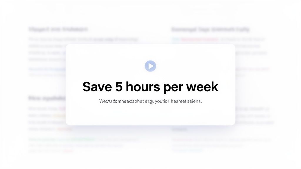
Use Customer Language: Dig through support tickets, sales calls, and reviews. What exact words do your customers use to describe their problems and the value they get? Use their language, not internal product jargon. Focus on benefits ("Save 5 hours a week") over features ("Automated time-blocking algorithm").
Align Visuals Perfectly: The supporting visual-especially a video-must demonstrate the value proposition in action. If your headline is about automating workflows, your video should show a workflow being automated. A mismatch between headline and visual creates confusion, undermining trust.
A/B Test Your Messaging: Don't assume your first draft is the best. Create two or three distinct variations of your value proposition and run a split test. Dedicate 50% of your traffic to each version and let the data show you which message truly connects.
Segment for Different Use Cases: If your SaaS product serves multiple customer segments (e.g., sales teams and HR departments), create separate landing pages for each. Tailor the value proposition and visuals to address the specific pain points of that audience for a much higher impact.
To see how this is put into practice, you can find many great examples of service explainer videos that pair messaging with motion. Following these steps ensures your core message isn't just stated but is seen and understood immediately.
3. Strategic Call-to-Action (CTA) Optimization
Your landing page has beautiful design and compelling copy, but conversions are flat. Often, the culprit is a weak or misplaced Call-to-Action (CTA) button. Strategic CTA optimization is a core component of improving conversion rates on landing pages because it bridges the gap between user interest and user action. It's not just about having a button; it's about making that button an irresistible, logical next step.
A high-performing CTA does more than just say "Submit." It communicates value, reduces friction, and aligns with the visitor's intent. Instead of one generic button lost at the bottom of the page, the best landing pages use a primary CTA that's visible instantly and secondary CTAs placed after key value propositions. SaaS companies like Stripe and Intercom master this by using specific, benefit-driven copy like "Start now" or "Start free trial," often paired with friction-reducing micro-copy like "No credit card required," which directly addresses user hesitation and builds confidence.
How to Implement CTAs Effectively
Optimizing your CTAs involves a thoughtful approach to copy, design, and placement, transforming them from passive elements into active conversion drivers.
Be Specific and Action-Oriented: Vague CTAs like "Get Started" are weak. Use specific, action-focused language that tells the user exactly what will happen next. "Start Your 14-Day Free Trial" is much more powerful and sets clear expectations.
Reduce Perceived Friction: Directly address common user anxieties right next to the CTA. Phrases like "No credit card required" or "Cancel anytime" are small but mighty additions that can significantly lift conversion rates by removing mental blockers.
Test Color and Contrast: Your CTA button should pop. While there's no single "best" color, high-contrast colors that stand out from your brand palette typically perform best. The goal is to make the button impossible to miss.
Ensure Mobile Accessibility: A huge portion of your traffic is mobile. Ensure your CTA buttons are at least 48x48 pixels so they are easy to tap with a thumb, preventing frustrating mis-clicks that cause users to abandon the page.
For deeper insights into crafting compelling directives, explore these High-Converting Call to Action Examples. By applying these principles, your CTA becomes the clear and easy choice for visitors ready to take the next step.
4. Social Proof and Trust Elements Integration
Your landing page makes a strong promise, but a new visitor has no reason to believe you. They’ve been burned by overhyped software before. Integrating social proof and trust elements is a fundamental strategy for improving conversion rates on landing pages because it shifts the burden of proof from your claims to the verified results of real customers. It's the digital equivalent of a friend's recommendation.
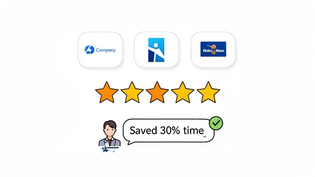
Social proof works by calming a prospect's inherent skepticism. Seeing logos of familiar companies, reading testimonials with specific metrics, or watching a quick video from a peer who solved the exact same problem builds instant credibility. For a SaaS product, this is critical. It shows your solution is not just theoretical but has been battle-tested and validated in the real world. Brands like Stripe and Slack master this by showcasing impressive customer logos and data-backed testimonials, effectively borrowing trust from established players.
How to Implement Social Proof Effectively
Randomly dropping a testimonial onto your page isn't enough. Strategic selection and placement are key to making social proof a conversion driver.
Focus on Specific Results: Vague praise like "it's great" is useless. A powerful testimonial mentions a concrete outcome. Aim for quotes like, "This saved our team 5 hours per week on reporting" instead.
Show, Don't Just Tell, with Video: Short video testimonials (15-30 seconds) are incredibly persuasive. Collect a dozen from happy customers and feature the best 3-5 on your landing page. The authenticity of a real person speaking is hard to fake and even harder to ignore.
Match the Proof to the Prospect: Ensure your social proof reflects your target customer. If you sell to B2B enterprise clients, showcase logos of well-known companies and testimonials from managers or directors. If you serve indie hackers, feature creators with their follower counts and business names.
Place It Strategically: Your most impactful testimonial or logo bar should be visible above the fold, near your primary call-to-action (CTA). Reinforce this trust by placing additional proof points near the final CTA or pricing section, just as a user might be having second thoughts.
Keep It Fresh: Update your testimonials and logos quarterly. This shows your company is active and continuously delivering value to a growing customer base, not coasting on old wins.
5. Headline and Subheadline Hierarchy Optimization
Your visitor lands on your page, and you have about three seconds to convince them to stay. If your headline is generic or confusing, they’re gone. Optimizing your headline and subheadline is a powerful method for improving conversion rates on landing pages because this combination is your first, and often only, chance to answer two critical questions: "What is this?" and "Why should I care?"
A strong headline grabs attention by focusing on a primary benefit, while the subheadline provides essential context or a secondary benefit. This one-two punch immediately clarifies your value proposition, preventing the user from having to scroll and search for what your product actually does. SaaS companies like Notion nail this with "Write, plan, collaborate" (what) paired with "One workspace. Every goal, project, task" (why), creating an instant connection with the visitor's needs. This clarity can lead to a significant boost in conversions by stopping bounces before they happen.
How to Implement Headline and Subheadline Optimization
Crafting the perfect headline isn't about finding a clever tagline; it’s about delivering a clear, compelling message that resonates with your target audience.
Start with a Benefit-Focused Headline: Instead of describing your tool, like "Task Management Software," lead with the outcome, such as "Save 5 Hours Per Week on Project Admin." This speaks directly to a user's pain point.
Use the Subheadline for Specificity: Your subheadline should expand on the headline's promise or introduce a secondary benefit. If your headline is "Scheduling, coordinated," your subheadline can clarify how: "Move scheduling forward by connecting your team's calendars in one place."
A/B Test Your Variations: Never assume you know which headline works best. Set up an A/B test with a 50/50 traffic split between two to three distinct headline variations. A proper test should run until you achieve at least 500 conversions per variation to ensure statistical significance.
Mirror Your Customer's Language: Dig through support tickets, sales calls, and reviews to find the exact words your customers use to describe their problems and desired solutions. Avoid internal jargon and use their language in your copy.
6. Form Field Minimization and Progressive Profiling
Your call to action is compelling, the offer is valuable, but visitors abandon the page the second they see your signup form. The culprit is often form friction; a long, intimidating list of fields asking for too much, too soon. Reducing the number of fields in your form is a proven tactic for improving conversion rates on landing pages because it directly lowers the barrier to entry.
Each additional field you ask for creates a small amount of resistance. This friction adds up, with each field potentially reducing conversions by several percentage points. SaaS leaders like Slack and Dropbox understand this, asking for only the bare essentials (like an email and password) to get a user into their ecosystem. The goal is to make signing up feel effortless, delaying requests for more detailed information until after the initial commitment is made. This strategy, known as progressive profiling, balances your need for data with the user's need for a quick, painless experience.
How to Implement Form Minimization Effectively
Optimizing your forms requires a strategic approach that respects the user's time and effort while still gathering the data you need to qualify leads.
Stick to the Essentials: For a primary top-of-funnel conversion, limit your form to 3-5 fields at most. Ask only for what is absolutely necessary to create an account or deliver the value promised, such as an email, password, and perhaps a name.
Move Profiling Post-Signup: Defer questions about company size, role, or phone number to the onboarding process inside your product. Once users have committed, they are far more willing to provide additional details, especially if you explain how it will improve their experience.
Optimize for Mobile: Mobile users are even less patient with long forms. Ensure your mobile forms are exceptionally minimal, with large, easy-to-tap fields and a streamlined layout. Remove any fields that aren't critical for the initial conversion.
Use Inline Validation: Provide real-time feedback as a user fills out the form, showing green checkmarks for correct entries or red highlights for errors before they hit submit. This prevents the frustrating experience of submitting a form only to be told there was a mistake.
For those running B2B SaaS, you can still gate higher-intent actions like a demo request with more fields, as the perceived value is greater. However, for initial signups or lead magnets, minimalism almost always wins. Adopting this philosophy ensures your form is a gateway, not a roadblock.
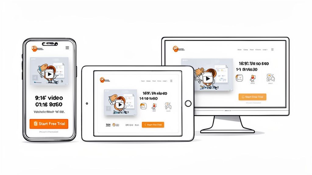
7. Mobile-First Design and Responsive Optimization
Your landing page looks perfect on a 27-inch monitor, but on a smartphone, it's a disaster. The CTA is impossible to tap, text wraps awkwardly, and your hero video is a tiny, letterboxed rectangle. With over 60% of web traffic coming from mobile, a desktop-centric design is no longer just a poor user experience; it's a direct hit to your bottom line. Adopting a mobile-first approach is key to improving conversion rates on landing pages because it forces you to prioritize clarity and function for the majority of your visitors.
Designing for the smallest screen first compels you to focus on what truly matters: a clear value proposition, an easy-to-complete action, and fast load times. You then progressively enhance the experience for larger screens, rather than trying to cram a complex desktop layout onto a mobile device. SaaS companies like Stripe and ConvertKit excel at this, ensuring their mobile experience is just as seamless and persuasive as their desktop one, closing the gap between high mobile traffic and low mobile conversions.
How to Implement Mobile-First Design
Building an effective mobile experience is about more than just making things smaller. It requires a specific, intentional strategy focused on speed, usability, and context.
Design for Thumbs: Place key interactive elements like CTAs within easy reach of a user's thumb. Make buttons large and provide ample spacing to prevent frustrating mis-taps. A sticky CTA at the bottom of the screen can work wonders.
Optimize Your Visuals: Mobile videos should be shot or edited for vertical viewing (9:16 aspect ratio) to fill the screen. Avoid horizontal 16:9 videos that appear tiny. For more ideas, you can review great examples of videos made for mobile. Also, ensure images are optimized and lazy-loaded to keep page speed high.
Keep Forms Minimal: On a mobile device, every extra form field is a point of friction. Stick to an absolute maximum of three fields for your initial capture. You can always ask for more information later in the user journey.
Test on Real Devices: Browser developer tools are useful, but they don't replicate the real-world experience of touch interaction and network throttling. Test your landing page on actual iPhones and Android devices to find usability issues you’d otherwise miss.
8. Product Demo and Feature Walkthrough Videos
Your copy claims your product delivers, but prospects are skeptical. They've heard it all before and want proof. A product demo video showing your actual UI in action is one of the most powerful tools for improving conversion rates on landing pages because it replaces marketing claims with tangible evidence.
Seeing the product work answers the visitor's core question: "Will this actually solve my problem?" Instead of imagining how features connect, they watch a real workflow unfold. This builds immediate credibility and helps them visualize success. SaaS companies like Loom and Calendly use this to great effect, showing their actual recording or scheduling flows. Authentic demo videos showing real product usage can lift conversions by showing, not just telling.
How to Implement Demo Videos Effectively
A great demo is more about clarity than cinematic flair. Structure and focus are critical to turning a viewer into a believer.
Stick to 60-90 Seconds: Viewer attention drops off a cliff after 90 seconds. Keep your main landing page demo focused on one core workflow that solves a primary pain point.
Show a Realistic Workflow: Start with the problem, then show exactly how your UI provides the solution. Use realistic content, not "dummy data," and consider a 2x speed with clear narration to maintain pace.
Guide the Viewer's Eye: Don't just record your screen. Use cursor movements, zooms, and simple graphic overlays to highlight key UI elements and direct attention to what matters most.
Include Captions and Narration: Add clear, concise audio narration explaining each step. Crucially, include captions to ensure your message is understood even when watched on mute, which is a common viewing scenario.
For those wanting to master this, you can learn more about how to make a product demonstration video that truly converts. Following these steps will ensure your video serves as a powerful conversion asset.
9. Scarcity and Urgency Elements (When Authentic)
You've built a solid offer, but prospects are still sitting on the fence. They're interested, but there's no compelling reason to act now. Adding authentic scarcity and urgency elements is a powerful strategy for improving conversion rates on landing pages because it addresses this hesitation head-on by creating a legitimate fear of missing out (FOMO).
These psychological triggers work by highlighting a limitation, either on time or quantity. This prompts a potential customer to make a decision rather than procrastinating. When used ethically, it's not a trick; it's a clarification of real-world constraints. SaaS companies use this effectively with limited beta spots, seasonal pricing, or launch-day discounts. The key, however, is authenticity. False scarcity, like a countdown timer that magically resets, will get you a conversion once but will destroy your brand's credibility forever.
How to Implement Urgency and Scarcity Ethically
Authenticity is the foundation of this tactic. If the scarcity isn't real, don't use it. Your audience is smart, and fake urgency is one of the fastest ways to lose their trust.
Be Explicit About the Limit: Clearly state what is limited. Is it the number of seats for a beta program? Is it a special price that ends on a specific date? The more transparent you are, the more credible the offer. AppSumo deals are a prime example of genuine quantity limits.
Tie Urgency to Value: Don't just say "offer ends soon." Explain why it's limited. For example, "We're offering this launch-day price to our first 100 customers to gather feedback" connects the urgency to a logical business reason.
Use Real Deadlines: If you use a countdown timer, it must count down to a real, immovable deadline. Once it hits zero, the offer must be gone. Faking this is a cardinal sin of conversion optimization. Product Hunt launches often feature "launch day only" offers that are genuinely temporary.
Plan for Latecomers: What happens when someone misses the deadline? Instead of showing a fake offer, provide a clear next step. A waitlist for the next beta cohort or a notification sign-up for the next sale maintains goodwill and captures future leads.
10. Friction Reduction Through Clear CTAs and Expectation Setting
Your call-to-action button is perfect, the color pops, but clicks are disappointingly low. The problem often isn't the button itself, but the uncertainty surrounding it. Reducing friction by setting clear expectations is a powerful method for improving conversion rates on landing pages because it answers the user's silent question: "What happens next, and what's in it for me?"
Anxiety and ambiguity are conversion killers. When a visitor hesitates, it's usually because they're weighing an unknown commitment. By using precise micro-copy near your CTA, you dismantle their objections before they solidify. Simple phrases like "No credit card required," "Takes 5 minutes to set up," or "Your first call is free" directly address fears about cost, time, and commitment. Companies like Slack and Calendly do this brilliantly, reassuring users that the process is quick and low-risk, which can reduce abandonment significantly.
How to Implement Friction Reduction Effectively
Effectively reducing friction requires you to get inside your user's head and proactively solve their concerns right at the point of decision.
Address Key Objections: Interview customers or survey bounced visitors to identify the top 2-3 fears or questions they have before signing up. Common ones include time commitment, unexpected costs, or setup complexity.
Use Specific Micro-copy: Place friction-reducing copy directly next to or below your primary CTA. Be specific. "Takes 3 minutes to set up" is much more convincing than "Quick setup."
Clarify the "Why": For free trials, state that a credit card is for seamless transition to a paid plan, not for immediate charges. For demos, clarify that it’s a "15-minute, no-pressure walkthrough."
Show, Don't Just Tell: A short video can be incredibly effective here. Show the actual post-signup experience-the first few clicks, the clean dashboard, or the simple onboarding flow. This demystifies the process and lowers conversion anxiety.
Clarifies next steps, reduces anxiety, improves retention metrics
From Guesswork to Growth: Building a System for Conversion
We’ve covered a lot of ground, from the magnetic pull of a well-placed product demo video to the subtle psychology behind a simplified form. If there’s one thing to take away from this guide, it’s this: improving conversion rates on landing pages isn't about finding a single magic trick. It’s about building a repeatable system.
You’re likely caught between two frustrating paths. There's the DIY trap, where you waste days wrestling with tools, only to get a result that looks amateurish and doesn't perform. Then there’s the agency drain, a slow, expensive process that often delivers high-production fluff instead of the structured clarity your users actually need. Both are rooted in guesswork and improvisation.
A systematic approach changes the game entirely. It shifts your focus from hoping for results to engineering them.
Your Actionable Roadmap from Here
So, where do you start? Don't try to implement all ten tactics at once. That's a direct path to overwhelm and muddled data. Instead, treat this as a structured process of continuous improvement.
Pick Your Battles: Start with the low-hanging fruit. Identify the one or two tactics from this list that address your most obvious weak points. Is your bounce rate sky-high on mobile? Start with mobile-first optimization. Are users dropping off at the form? Tackle form field minimization.
Hypothesize and Test: For each change, form a clear hypothesis. For example: "By replacing our static hero image with a 60-second product demo video, we believe we can increase sign-ups by 15% because it will clarify our value proposition instantly." Use A/B testing tools to validate your assumptions with real data, not just gut feelings.
Measure, Learn, Repeat: Track the right metrics. An increase in sign-ups is great, but what about the quality of those sign-ups? Are they activating? Are they becoming paying customers? Connect your landing page metrics to your broader business goals. Each test, whether it wins or loses, provides a valuable lesson that refines your system.
The goal isn't a one-time conversion spike; it's building a predictable engine for growth. Each optimized element, from the headline to the CTA button, becomes a gear in that engine, working together to turn traffic into loyal users.
The Power of a Structured Framework
Mastering these concepts means you stop throwing money and time at problems and start making strategic, data-informed decisions. You’re no longer just a founder or a product manager; you’re an architect of persuasion. You understand how copy, visuals, trust signals, and user experience interlock to guide a visitor from curiosity to commitment.
Ultimately, improving conversion rates on landing pages is an act of empathy. It’s about deeply understanding your visitor’s pains and goals, then methodically removing every point of friction that stands in their way. It’s about making their decision to trust you as easy and clear as possible. The tactics are just the tools; the real work is in building a user-centric system that consistently delivers value. And that system is your most durable competitive advantage.
Tired of your landing page videos feeling like a shot in the dark? Forgeclips provides a framework-based system to create clear, high-performing product demo videos in hours, not weeks. Ditch the DIY struggle and the agency costs, and see how a structured approach can make your landing page your best salesperson.