A software demo video is supposed to be your ace in the hole—a guided tour showing prospects exactly how your product solves their biggest headaches. It’s designed to demonstrate real value, not just rattle off a list of features, and turn viewers into buyers.
Why Your Software Demo Video Isn't Working
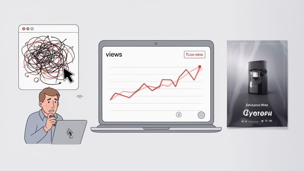
But let’s be honest. You pour weeks into shipping a brilliant new feature, cut together a demo video to launch it, and… nothing. The view count flatlines. Sign-ups don’t budge. You’re still stuck explaining the same basic concepts on every single sales call.
This isn't a product failure; it's a communication gap.
Most demo videos fail to connect because they fall into one of two traps. If you're a SaaS founder or a product manager, these will feel instantly familiar.
The Two Demo Video Traps to Avoid
SaaS teams almost always get stuck in one of these two pits, leading to wasted time, budget, and opportunity. A quick look at the table below makes the trade-offs clear.
Pitfall
The 'DIY Trap'
The 'Agency Drain'
What It Looks Like
A frantic, unscripted screen recording with a shaky cursor and a robotic voiceover.
A slick, overproduced commercial with beautiful graphics but almost no actual product UI.
The Cost
Minimal cash, but massive damage to your brand’s credibility. It looks unprofessional and confusing.
A huge budget for a video that’s all sizzle, no steak. It hides the very thing users need to see.
The Result
Viewers get confused and drop off. Your product looks more complicated than it is.
Viewers are entertained but have no idea what your product actually does or how it works.
The Bottom Line
A cheap video that actively repels potential customers.
An expensive video that generates zero meaningful engagement or ROI.
Both paths lead to the exact same place: a video that doesn't perform and an opportunity completely squandered. The DIY approach is quick and cheap but makes your product look amateurish and hard to use. The agency route gives you high-production fluff that costs a fortune but often hides the UI your customers need to see.
The core issue isn't a lack of effort or a bad product. It's a lack of structure. Great demos are engineered with a clear story, not improvised.
The Real Cost of a Bad Demo
A weak software demo isn't just a marketing misstep; it actively drains revenue and time from your business. The data is clear: an effective demo is a mission-critical asset.
Consider that 80% of people have bought or downloaded an app after watching a brand’s video. Meanwhile, an overwhelming 93% of video marketers say video directly increases user understanding of their product or service.
When your demo fails, you’re not just losing views. You’re losing qualified customers who were ready to make a decision.
For product managers, this means more support tickets and endless one-on-one demos that don't scale. For founders, it means a landing page that can’t convert and a sales cycle that drags on forever.
The fix isn't to spend more money or just try harder with the same broken approach. It’s about shifting your mindset from "making a video" to "building a communication asset." This requires a framework that puts clarity and structured storytelling first. A demo built this way can effectively grab the attention of your target audience and guide them toward a decision.
Building the Foundation for a High-Converting Demo
Before you even think about hitting record, the fate of your software demo is pretty much sealed. I’ve seen it time and again: great demos are engineered with a plan, not improvised on the fly. This first phase is where you turn a vague idea into a strategic asset designed to actually get results.
It all starts with answering one deceptively simple question: What is the single, measurable action you want the viewer to take after watching? Without a clear goal, your video is just expensive noise.
Define One Clear, Measurable Goal
A video without a job to do is pointless. Your goal dictates every other choice you'll make, from the script all the way to the final call-to-action. Don't try to make one video do everything. Pick a lane.
What is this demo for?
Increase free trial sign-ups: Show just enough to make prospects desperate to get their hands on your product.
Reduce support tickets for a specific feature: Clearly walk through a common workflow that trips up new users.
Drive more sales calls: Highlight a high-value outcome that makes a one-on-one conversation feel essential.
Boost feature adoption: Announce a new tool and show existing users exactly how it makes their lives better, right now.
Choose one primary goal and write it down. This becomes the north star for your entire project. It keeps every second of your video honest and purposeful.
Understand Your Audience's Real Problem
Now that you know what you want, it's time to focus on who you're talking to. A classic mistake is creating a demo that appeals to you, the creator, instead of the person who's actually going to use it. You have to get inside their head.
A time-crunched founder couldn't care less about the intricate details of your API. They care that your software saves them 10 hours a week. A developer, on the other hand, might need to see exactly how that API integration works. Your demo has to speak their language.
A high-converting software demo video doesn’t sell features; it sells a solution to a painful, specific problem. Your job is to connect your UI to their relief.
To really nail this, it helps to understand the core principles of how to create product videos that connect with an audience. This foundation in user empathy is absolutely non-negotiable.
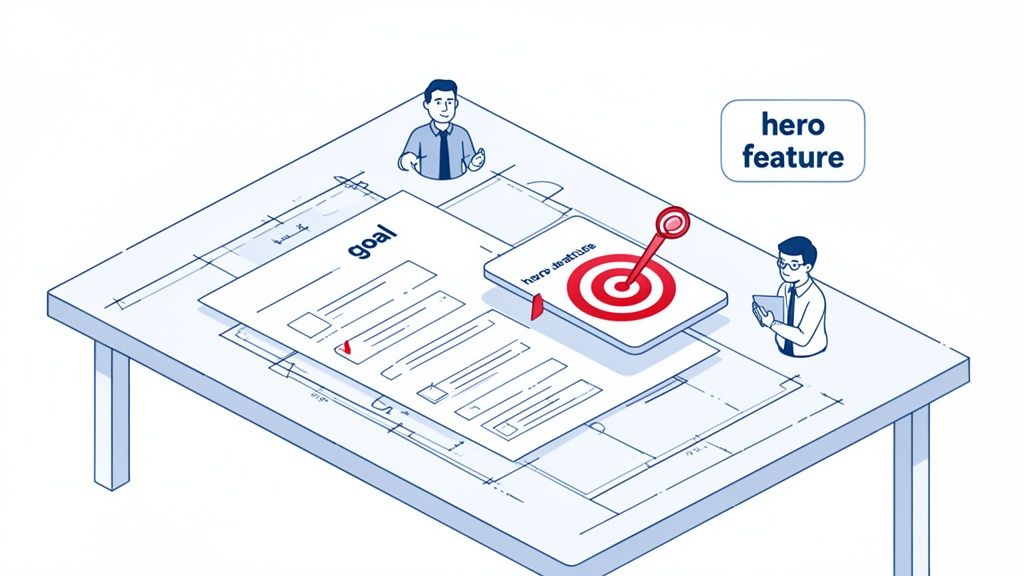
Choose Your Hero Feature and Story
You can't show everything. Trying to cram every last feature into a 90-second video is the fastest way to confuse and overwhelm your viewer. It's a recipe for a bounce.
Instead, you need to pick a "hero feature"—the one function that best demonstrates your product's core value.
So, how do you pick your hero?
Find the "Aha!" Moment: Which feature makes users light up and say, "Oh, I get it now"? That's your winner.
Solve the Biggest Pain: Which function directly addresses the most urgent, hair-on-fire problem your audience has?
Showcase Your Differentiator: What does your product do that the competition can’t? Lead with that.
Once you have your hero feature, you build a simple story around it. Don't just show random clicks; narrate a journey. Start with the frustrating "before" state (the problem), introduce your hero feature as the game-changing tool, and end with the satisfying "after" state (the solution). This simple narrative arc makes your software memorable and, more importantly, desirable.
This planning phase is critical, and mapping out your narrative visually makes all the difference. For more on this, grab our free storyboard template for video to get started.
Scripting Frameworks That Tell a Compelling Story
Let's kill the idea that a script is just a list of features to read aloud. It’s not. A great script is the entire structural backbone of your video—it's the story, the persuasive argument, and the reason someone stops scrolling.
Without a solid framework, you're just improvising. And improvisation in a product demo almost always leads to rambling, confusion, and zero conversions.
This is where proven storytelling frameworks make all the difference. Think of them less as rigid rules and more as time-tested structures that give your message clarity and impact. They force you to think like your customer, turning a boring product tour into a compelling solution.
Hook Viewers with the Problem-Agitate-Solution Framework
The Problem-Agitate-Solution (PAS) framework is brutally effective because it’s built on empathy. It meets your audience exactly where they are—stuck with a frustrating problem—long before you ever mention your product.
First, you define the problem. Don’t just say "managing projects is hard." Show it. "You’re drowning in spreadsheets, your team keeps missing deadlines, and nobody knows who’s working on what." This grabs their attention because they feel seen.
Then, you agitate it. This is where you twist the knife a little. Pour salt on the wound. "Every Monday morning meeting is a mad scramble to figure out project status, wasting hours and piling on the frustration. That big launch you planned? It's now at risk." This makes the pain more acute and the need for a solution urgent.
Finally, you introduce your software as the solution.Now you can be the hero. "Here's how you get your Monday mornings back." You then demonstrate the one specific feature that directly solves the chaos you just agitated. This structure works because it frames your product not as a piece of technology, but as a source of relief.
Connect Features to Value with Feature-Benefit-Proof
Once you've hooked them, you need to show them how your software delivers. The Feature-Benefit-Proof (FBP) framework is perfect for this. It’s a simple but powerful sequence for demonstrating functionality in a way that actually matters to the user.
Feature: State the feature clearly. "This is our automated reporting dashboard."
Benefit: Immediately translate it into a user-centric outcome. "This means you can stop manually pulling data every Friday and get a real-time view of your team's progress in seconds."
Proof: Show it in action. This is the screen capture part of your demo. You visually demonstrate the feature working, proving the benefit you just promised.
Never show a feature without immediately explaining its benefit. People don't buy features; they buy better versions of themselves. FBP ensures you're always selling the outcome, not just the tool.
For a deeper dive into scripting, you can learn more about how to make a script that turns viewers into customers in our detailed guide.
Writing a Voiceover That Sounds Human
Your script will be delivered by a voice, and that voice needs to sound authentic. Nothing kills a great video faster than a robotic, monotone voiceover.
Write like you speak. Use conversational language, shorter sentences, and a supportive tone, as if you're explaining your product to a colleague over coffee. A great trick is to read your script out loud as you write it. If it feels awkward to say, it will sound even worse in the recording.
Don’t Forget the Silent Script
A huge percentage of videos, especially on social media, are watched with the sound off. This means your demo needs a "silent script"—on-screen text overlays that carry the entire story without a single spoken word.
Your silent script isn't a word-for-word copy of your voiceover. It’s a parallel narrative.
It should be short and punchy. Think headlines and subheadings that highlight key actions and benefits.
It needs to be contextual. Use arrows, callouts, and highlights to draw the viewer’s eye to specific UI elements as they appear.
It must still tell a story. The text overlays should guide the viewer from problem to solution visually, creating a complete narrative loop even on mute.
By scripting for both sound-on and sound-off, you make sure your message lands no matter how someone is watching.
Capturing Your UI with Clarity and Professional Polish
Your script tells the story, but your screen capture shows it. The way you present your product is just as critical as what you say about it. A messy, confusing, or unprofessional-looking UI can instantly kill a demo, making your software feel untrustworthy and hard to use.
This isn’t about adding slick visual effects or high-production fluff. It’s about structured clarity. The goal is to make your software look as intuitive and powerful as it actually is. It's the difference between a video that converts and one that gets closed in seconds.
Prepare Your Digital Stage
Before you even think about hitting record, you have to set the stage. A clean recording environment is non-negotiable. It removes distractions and locks the viewer’s focus on your product’s value.
Start by creating a dedicated user profile or workspace just for recording. This gives you a pristine environment—no personal files, random browser history, or custom settings that might confuse people. It's a simple step that pays off big in perceived professionalism.
Next, curate your screen to show only what’s absolutely essential.
Close every unnecessary app. No Slack pings, email pop-ups, or calendar reminders.
Hide your desktop icons. A cluttered desktop is the digital equivalent of a messy room; it just screams chaos.
Clean your browser. Ditch the bookmarks bar, hide extra extension icons, and use a fresh, focused window.
Think of it like a chef prepping their station before service. Everything is clean, organized, and ready for a flawless performance.
Get the Resolution and Aspect Ratio Right
Technical details like screen resolution can make or break your video’s clarity. Recording in the wrong dimensions leads to blurry text and a frustrating experience, especially on mobile.
As a firm rule, always record in a 16:9 aspect ratio. This is the universal standard for YouTube, website embeds, and nearly every video player. A resolution of 1920x1080p is the gold standard for full HD clarity. This ensures your UI is crisp and your text is perfectly readable, no matter where it's watched.
Recording at 1080p isn't just a technical spec; it's a sign of respect for your viewer. A sharp, clear video shows you care about their experience, building subconscious trust in your product.
Guide the Eye with Strategic Movement
Once you start recording, your cursor becomes a key part of the story. Frantic, jerky movements create visual noise and make your product feel complicated. Your goal should be deliberate, purposeful action.
Use smooth, intentional zooms and pans to direct the viewer’s attention. When you’re about to click a button or highlight a feature, a slow zoom-in is a powerful visual cue. It tells the viewer, "Pay attention. This part is important."
Here are a few pointers for making your on-screen motion feel controlled and confident:
Slow your cursor down. Move it at roughly 50% of your normal speed.
Use highlights. Many screen recorders let you add a subtle highlight to your cursor, making it much easier to follow.
Pause for effect. When your cursor lands on a key button or menu item, let it rest for a beat before clicking. This gives the viewer’s brain time to register the action.
These small tweaks create a calm, controlled flow that makes your software look incredibly easy to navigate. And while you’re focusing on visual clarity, remember that audio and lighting are just as crucial for any on-camera segments. Our guide on lighting for video recording offers some great, practical advice.
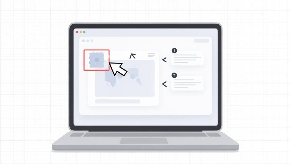
Use Text Overlays That Clarify, Not Clutter
On-screen text is great for adding context, especially for silent viewing, but it’s easy to overdo it. The "Rule of Three" is a solid guideline for keeping your overlays clean and effective.
Aim for no more than three lines of text on the screen at once. This text should be short, punchy, and directly related to what’s happening. Instead of just transcribing your voiceover, use text for concise headlines or benefit-driven statements. For example, as you click a button, an overlay could pop up saying: "Automate Weekly Reports" or "Save 5 Hours of Manual Work." This reinforces value without burying the interface you’re trying to show off.
The Sanity-Saving Middle Path: The Forgeclips Approach
You have the strategy, the script frameworks, and even a solid grasp of UI capture. So why does it feel like you’re still miles away from a finished video?
This is the exact spot where great plans fall apart. It's the execution gap—the chasm between knowing what to do and actually having the time and resources to do it. All too often, it forces teams right back into the old, broken cycle of half-finished projects and wasted effort.
This is precisely why we built Forgeclips. We saw too many SaaS teams stuck between two bad options: the slow, expensive “Agency Drain” or the frustrating, often unprofessional “DIY Trap.” There had to be a better way. Forgeclips represents a philosophy of structure—a sensible middle path.
Structure Over Improvisation
At its core, the Forgeclips approach is a philosophy built on structure. Instead of staring at a blank canvas and hoping for inspiration, you start with a proven framework designed for a specific goal—like a punchy product promo or a detailed feature highlight.
This completely removes the guesswork. Right from the start, your video is being engineered for performance. We’re not just aiming for creative flair; we’re building for clarity.
The most effective software demo video isn’t the one with the biggest budget or fanciest effects. It’s the one with the clearest structure, built to solve a specific problem for a specific audience.
This principle of building on data and structure aligns with other modern product development methods. For instance, validating ideas quickly through advanced techniques like synthetic user testing can be invaluable. It’s all about removing assumptions and building on a solid foundation.
The Hybrid Model That Solves the Core Problems
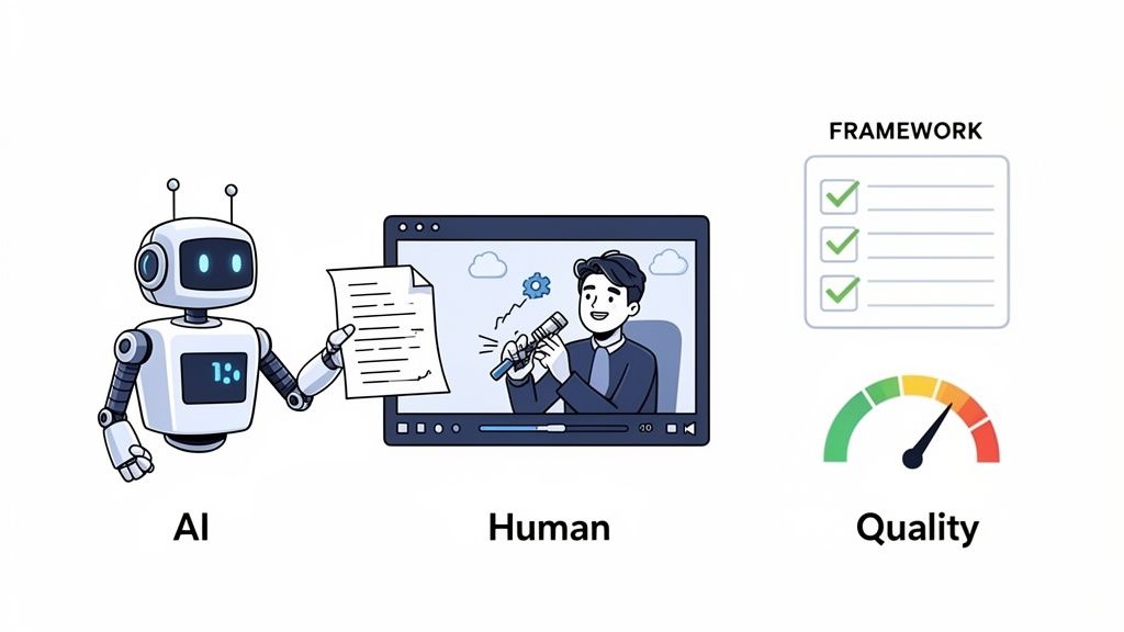
To deliver on this promise of structure and speed, we developed a hybrid production model that gives you the best of both worlds. It’s a system designed to fix the three biggest headaches in video creation: cost, time, and quality.
Our approach marries two powerful elements:
AI for Speed: We use AI to blast through the most tedious parts of the process, like creating initial script drafts from your inputs and generating clean, consistent voice-overs. This alone cuts production timelines from weeks down to days.
Expert Human Polish: AI gets you 80% of the way there, and it does it fast. But that last 20% is where real quality lives. Our team of expert editors takes the AI-generated foundation and meticulously refines the pacing, polishes the visuals, and ensures the final video meets a professional standard that converts.
This combination means you never have to sacrifice quality for speed. You get a high-performing asset that looks and sounds incredible, delivered in a fraction of the time and at a fraction of the cost of traditional agencies. It’s a smarter system built for modern SaaS teams—the logical solution for founders and product managers tired of the old way.
FAQs: Real Answers for Common Demo Video Questions
You’ve got a plan, but a few nagging questions always seem to surface right before you hit record. We hear them all the time from SaaS founders and marketers.
Getting these right isn't just about ticking boxes. It's often the difference between a demo video that drives sign-ups and one that just collects dust. Here are the direct, no-fluff answers we've learned from producing thousands of software videos.
How Long Should a Software Demo Video Be?
For marketing purposes on a landing page or social ad, a tight 60-90 seconds is your target. This is just enough time to hook a viewer with a problem, present your core solution, and guide them to a clear next step before their attention inevitably wanders. Longer videos for in-app onboarding (2-5 minutes) are fine, as the audience is already captive. The golden rule is to respect the viewer’s context. Your goal is maximum impact in minimum time.
Should I Use a Voiceover or Just Music?
For a software demo video, a professional voiceover is essential for clarity. A music-only video looks slick but forces the viewer to guess the "why" behind every click. A confident, warm voiceover acts as a guide, builds trust, and explicitly connects on-screen actions to real-world user benefits. Music sets the mood, but the voiceover is what actually explains and sells.
What Are the Most Common Demo Video Mistakes?
Most failed demo videos fall into the same three avoidable traps:
The 'Feature Tour' Trap: A boring, chronological list of every feature without context. Viewers care about solving their one big problem, not your whole feature list.
Messy, Unrehearsed Capture: Frantic cursors and random notification pop-ups make your product look clunky and untrustworthy. Always use a clean demo environment.
No Clear Call-to-Action (CTA): The video just... ends. Always conclude with a single, unmissable instruction, like ‘Start Your Free Trial.’
How Do I Measure the ROI of My Demo Video?
You can’t measure ROI without a clear goal. Tie video performance to a specific business objective. First, check player metrics like Play Rate and Engagement Rate. Next, connect them to your business goal. The best way is with an A/B test: run a landing page with the video against a version without it. The difference in sign-ups or booked demos is your true ROI.
Why Do DIY Demos Look So Unprofessional?
The "DIY Trap" isn't about a lack of effort; it's a lack of structure and polish in key areas. Common issues include a shaky, unplanned cursor path, an inconsistent or robotic-sounding voiceover, poor audio quality with background noise, and a messy screen with distracting notifications. These small details add up, subconsciously signaling to viewers that the product itself might be just as chaotic and hard to use.
Ready to skip the guesswork and create a software demo video that’s built to perform from day one? At Forgeclips, we combine proven scripting frameworks with a hybrid AI-and-human production system to deliver high-quality, conversion-focused videos in just 48 hours. See how our structured approach can work for you at https://forgeclips.com.